
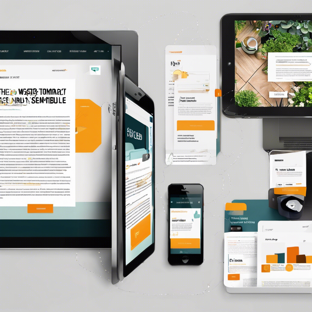
In today’s digital landscape, where over half of web traffic comes from mobile devices, having a mobile-friendly blog design is no longer optional—it’s essential. A seamless experience on smartphones and tablets can significantly boost user engagement, reduce bounce rates, and increase conversion opportunities. Yet, many websites still overlook the pivotal role mobile optimization plays in content strategy, user experience (UX), and search engine rankings.
Why Mobile-Friendly Design Matters More Than Ever
The shift toward mobile browsing has fundamentally changed how users interact with content online. Whether scrolling through a news article on the morning commute or catching up on blog posts during a lunch break, readers expect a smooth, accessible, and responsive experience on every device.
Google’s mobile-first indexing, which prioritizes mobile versions of websites in its search rankings, underscores this trend. Without a mobile-optimized blog, even the most insightful articles risk getting buried deep in search results.
Key statistics to consider:
| Metric | Impact |
|---|---|
| 60%+ of global web traffic is mobile | Most users will visit your blog from a mobile device |
| 53% of mobile users abandon slow sites | Speed and responsiveness are critical |
| Google prioritizes mobile-first indexing | Affects SEO and organic search visibility |
User Experience: The Core of Mobile Optimization
A mobile-friendly blog design is about more than just resizing content to fit smaller screens. It’s about creating a fluid, intuitive, and frictionless experience that meets the unique needs of mobile users.
Elements of a superior mobile UX:
-
Responsive layouts: Content, images, and videos automatically adjust to various screen sizes.
-
Readable typography: Fonts that are easy to read without zooming in.
-
Touch-friendly navigation: Buttons and links that are easy to tap with a finger.
-
Minimalist design: Avoid clutter and ensure fast-loading pages.
“Great mobile UX is not just about fitting content into a small screen—it’s about adapting the entire user journey to mobile behavior.” – UX Design Institute
SEO Benefits of Mobile Optimization
Search engine algorithms increasingly favor mobile-friendly websites. Mobile responsiveness directly influences page speed, bounce rates, and dwell time—all of which are ranking factors.
SEO advantages of mobile-friendly design:
-
Higher rankings in mobile search: Google’s algorithms prioritize mobile-optimized sites.
-
Improved user engagement: A smooth experience encourages users to stay longer and explore more content.
-
Reduced bounce rates: Frustrated users leave quickly when confronted with poor mobile UX.
-
Increased backlinks: High-quality mobile experiences can boost your chances of earning backlinks from authoritative sites.
Content Presentation for Mobile Audiences
When it comes to mobile readers, content consumption habits shift compared to desktop users. Mobile users often skim content and favor concise, scannable formats.
Tips for optimizing content layout:
-
Short paragraphs: Break text into digestible chunks.
-
Subheadings: Guide readers through the article and enhance skimmability.
-
Bullet points & numbered lists: Present key information clearly.
-
Interactive media: Use responsive images, videos, and infographics to engage users visually.
-
Calls-to-action (CTAs): Make CTAs bold and strategically placed to drive interaction.
Here’s a simple structure example:
The Impact on Monetization and Conversions
A blog that isn’t mobile-friendly risks losing not just visitors but potential revenue streams. Whether your blog relies on affiliate marketing, advertising, or product sales, conversion rates plummet if the mobile experience frustrates users.
Mobile-friendliness supports:
-
Affiliate clicks: Clear CTAs and smooth navigation drive higher click-through rates.
-
Ad revenue: Display ads are more effective when they load properly on all devices.
-
Lead generation: Simple, mobile-optimized forms encourage more sign-ups.
Common Mistakes to Avoid
Many blogs miss the mark on mobile optimization by focusing solely on appearance rather than functionality.
Top mobile UX pitfalls:
-
Ignoring site speed: Uncompressed images and heavy scripts slow down load times.
-
Small clickable areas: Buttons and links that are too close together frustrate users.
-
Overusing pop-ups: Intrusive interstitials can lead to penalties from search engines and drive users away.
-
Poor typography: Fonts that are too small or too light make reading difficult.
-
Neglecting testing: Failing to test across various devices can result in display issues.
Leveraging Data Insights to Enhance Mobile Design
Data-driven insights can fine-tune your blog’s mobile performance. Use analytics tools to identify weak spots and opportunities.
Recommended tools:
-
Google Analytics 4: Track bounce rates, session durations, and device-specific metrics.
-
Google Search Console: Identify mobile usability issues affecting search performance.
-
Hotjar or Crazy Egg: Visualize where users click, scroll, and abandon pages via heatmaps.
Personalized recommendations:
-
If your bounce rate is high on mobile, investigate your site speed and readability.
-
High exit rates on certain blog posts? Rework your CTAs and ensure images load correctly.
-
If most traffic comes from mobile users in specific regions, consider optimizing content and CTAs for cultural relevance and local trends.
The Future of Mobile-First Design
As new devices and screen sizes emerge—think foldable smartphones and wearable tech—the future of mobile design will center on adaptability and user-centricity. Progressive Web Apps (PWAs), accelerated mobile pages (AMP), and voice search optimization are trends worth monitoring.
Emerging trends to watch:
-
PWAs: Blend the best of web and mobile app experiences.
-
AI-powered personalization: Dynamic content tailored to individual users.
-
Voice-optimized content: Conversational, long-tail keyword usage to capture voice searches.
-
Dark mode compatibility: User-friendly design for low-light browsing.
Related articles worth exploring:
A well-designed, mobile-optimized blog is one of the most powerful tools for building authority, growing your audience, and driving conversions. Whether you’re a seasoned publisher or just starting out, investing in a responsive and intuitive mobile experience will pay dividends in reach, engagement, and revenue.
Ultimately, mobile-first design isn’t just about following trends—it’s about meeting your readers where they are and providing value on their terms.